A/B testing is built into almost every email marketing platform in existence. It’s a method for testing a user’s behavior by experimenting with different campaign elements. But having an A/B testing tool and running effective A/B tests are two very different things.
For example, some simple A/B tests that you might be inclined to run include:
- Red buttons VS Blue buttons
- Text-only subject lines VS Subject lines with emojis
- Image 1 VS Image 2
But these kinds of A/B tests don’t often deliver meaningful results. Even if you have a hypothesis as to why your subject line emoji might increase opens, it’s a low-value test that isn’t likely to make a meaningful impact on donations.
The reason I know this is because we’ve tested it at NextAfter. In fact, we’ve conducted nearly 3,000 online fundraising experiments—and 1300+ focus specifically on email fundraising. Over time, the results have shown a few essential areas that you should test in your emails first to see a major increase in performance.
Let’s look at 3 of these email fundraising a/b tests that are easy to set up and have a high likelihood of increasing your donations and revenue.
#1. Get rid of your nicely designed email template.
If you do a quick search for “email design best practices,” you probably won’t find any “experts” recommending that you abandon your design altogether. But just because a designed template is a “best practice” doesn’t mean it’s the best performing. Time and time again, we have found that getting rid of your nicely designed email template leads to more donations.
In the experiment below, you can see the results.
Both emails being sent have the same exact copy. They have the same call-to-action. They’re both trying raise funds to help hit a specific campaign goal.
Version A uses the typical “best practice” email appeal template. It utilizes imagery, logos, and colors to make it feel branded and official. In addition, it uses a progress bar to show how close they are to the goal.
Version B takes a fundamentally different approach. Even though the copy is entirely the same, version B feels more human. It stripped away the images, most of the HTML template design, the progress bar, etc.
Instead, version B looks like a real email from a friend. Better yet, it looks like an email you might write to an individual donor from your own inbox.
By getting rid of the design and communicating in a way that looks more authentic and personal, they saw a 29% increase in donations. 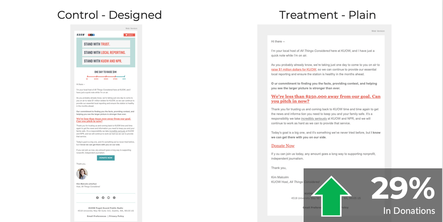 This email fundraising a/b test is easy to setup.
Go to your email platform and start creating an A/B test for your next email campaign. Don’t worry about new designs or fancy coding. Just copy your text, paste it into the editor, and soon you’ll be testing how a more humanized email fundraising approach affects your donations.
Key Takeaway: Send emails that look and feel human and authentic. They’re easier to create and lead to more donations.
#2. Send your email from a real human being.
If you’re going to start sending email that looks more human, you might as well start sending them from a real person as well.
While it’s tempting to put your brand or organization name in your email sender line, the data says that this is not what’s most effective.
As fundraisers, we often err on the side of the familiarity, authority, and credibility that our brand name brings. But donors consistently show us that they respond and give to people—not to faceless organizations.
In this experiment below, you see that Version A was sent from an actual human: Kent Lassman. Version B was sent from Kent’s organization. When testing these two senders side by side, they saw that emailing donors as an actual human being led to a 28% increase in opens. 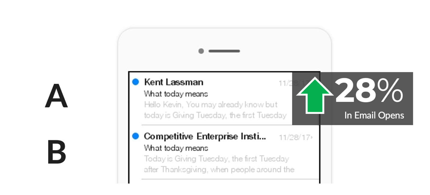 Key Takeaway: Send your emails from a real person. People give to people, not to faceless organizations.
#3. Make your call-to-action abundantly clear.
There are a lot of things you can do in your email to try to increase clicks. Writing shorter emails, including more links, using a video thumbnail, or using vague calls-to-action all tend to get more people to click.
One of the most important learnings about email fundraising, however, is that more clicks does not always mean more donations. In fact, in many cases, the strategies that increase clicks reduce clarity and motivation—leading to fewer donations and less revenue.
The clearest example of this is your call-to-action.
Vague calls-to-action often increase clicks. However, they don’t provide any clarity around what you’re actually asking a donor to do. Some common fundraising calls-to-action include:
- Stand with us
- Give hope
- Learn more
- Make your voice heard
- Join the movement
While all of these calls-to-action may be familiar or common, they don’t all lead to more donations.
In the experiment below, you can see that clarifying the action you want your donor to take is essential. And being vague decreases giving.
Version A asks donors to “make your year-end gift today.” It’s clear that the donor is being asked to give.
Version B asks donors to “stand with us today.” But your donor may be left wondering:
- Do you want me to give?
- Am I supposed to sign a petition?
- Do you want me to subscribe to something?
- Are you asking me to volunteer?
The vague call-to-action increased clicks by 91%. But it decreased donations by 50%. 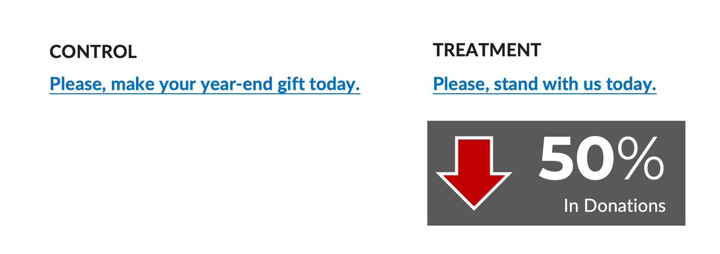 Key takeaway: Write a clear call-to-action so that donors know exactly what you’re asking them to do.
Making sure you run a meaningful A/B test
The only way to know exactly what works to increase giving is to A/B test. But testing can get complicated fast—and many A/B testing experts make it seem like a scary science that requires a trained data scientist.
That’s why we try to make A/B testing as accessible as possible to you—everyday nonprofit fundraisers and marketers. If you want to dive deeper, you can check out this A/B Testing Guide for Nonprofits that walks you through 8 steps to running an effective A/B test.
You’ll have all the tools you need to get started running your first email fundraising a/b test and learning exactly what works to increase your email donations.