Getting website visitors to come to your nonprofit’s donation page is one thing—but getting them to donate is another thing entirely. If you’re wondering how to get more donations online, start by asking yourself the five questions below. We’ll reflect on how well your donation page is working and what improvements you could make starting today. You’ll walk away with some concrete examples of donation pages that do it well, along with some practical pointers for improving yours.
Let’s jump right in with the first question to ask yourself.
1. Does my donation page seem like a finish line or a starting line?
One of the most common donation page mistakes is assuming that the website visitor has already decided to donate. With this assumption, the donation page is treated like the finish line of a race. The visitor has already run this far—so surely they plan to finish, right?
Unfortunately, this metaphor often falls short. Most website visitors who come to your donation page will not do so with their wallet in hand and their mind firmly made up. Instead, they likely have some lingering doubts and questions: how you’ll use their money, whether they’ll actually make a difference, whether it’s worth the time and effort… The truth is that the donation page is more often the starting line, not the finish line. Visitors may click to this page intending to donate, but they still need encouragement to follow through.
We’ll get into what “encouragement” might mean later, but let’s start by looking for one sure sign of this donation-killing assumption: a donation page that’s essentially blank. For example, look at the (anonymized) donation page below. See how there’s only a tiny amount of text here? No images, logos, testimonials, statistics, or other supporting elements? The majority of the page is all about the money, making it clear that this organization views the page as a final step—not as the starting point that it so often is.
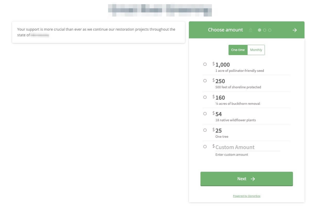
Action Item #1
Ask yourself whether you’re treating your donation page like a finish line. Do a quick check by pulling up your current page and performing a “squint test”: Does the page seem blank or empty? If so, don’t worry—that just means that we have a fantastic opportunity to improve it! The rest of this article will give you hands-on tips on what to improve and help you design the page as if you’re speaking to someone who knows nothing about you, why they should donate, or what you’ll do with their money.
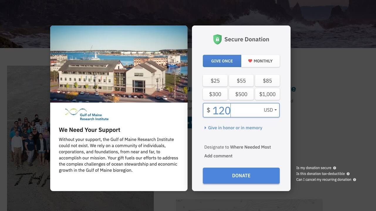
You’ll be able to persuasively make the case for what you do, like the Gulf of Maine Research Institute has done so well, even in a small popup.
2. What other assumptions am I making?
If you realize that your organization is currently making the assumption in question #1, you’re not alone. But that means that you may be making other potentially damaging assumptions, too. It’s worth asking yourself if any of these other common assumptions are accidentally being made on your donation page:
- The visitor already knows what you do and why their support matters.
- Trust is already established.
- The visitor already knows how you’ll use their money.
- It’s clear as to what makes you different.
- The visitor already knows whether the donation is tax-deductible.
Every assumption leaves a gap in the visitor’s mind. If you don’t answer their questions, they’re left to answer them for themselves. At best, this introduces friction and, at worst, takes them away from your donation page altogether. It’s a rare person who will leave a donation page to find an answer and then return to actually finish donating!
Action Item #2
Look again at the bullets above and ask yourself if your donation page is making these assumptions. It’s as easy as it sounds. Pull up your donation page (right now, why not?) and go down the list, one by one. Do you…
- …tell the visitor what you do? Is your nonprofit brand, mission, and work evident on the donation page? Do you provide imagery, statistics, or other elements to support this message?
- …include trust-building elements? Consider testimonials, accreditations from third-party groups (like Charity Navigator), and a note about transaction security.
- …tell the visitor how you’ll use their money? This is especially important if the potential donor is expecting to give to a particular campaign. If you’ve brought them to this page by highlighting a special program, they should see that their money will fund that program. (More on this below in Question #3: Where is the user coming from?)
- …explain what makes you different? Even if a donor completely agrees with what you do, there are dozens of other organizations they could support instead. What’s different about you, and how are you inviting the donor to be a real part of your work?
- …state whether the donation is tax-deductible? This is more important for some nonprofits than others. If it’s a question you frequently receive, answer it preemptively here.
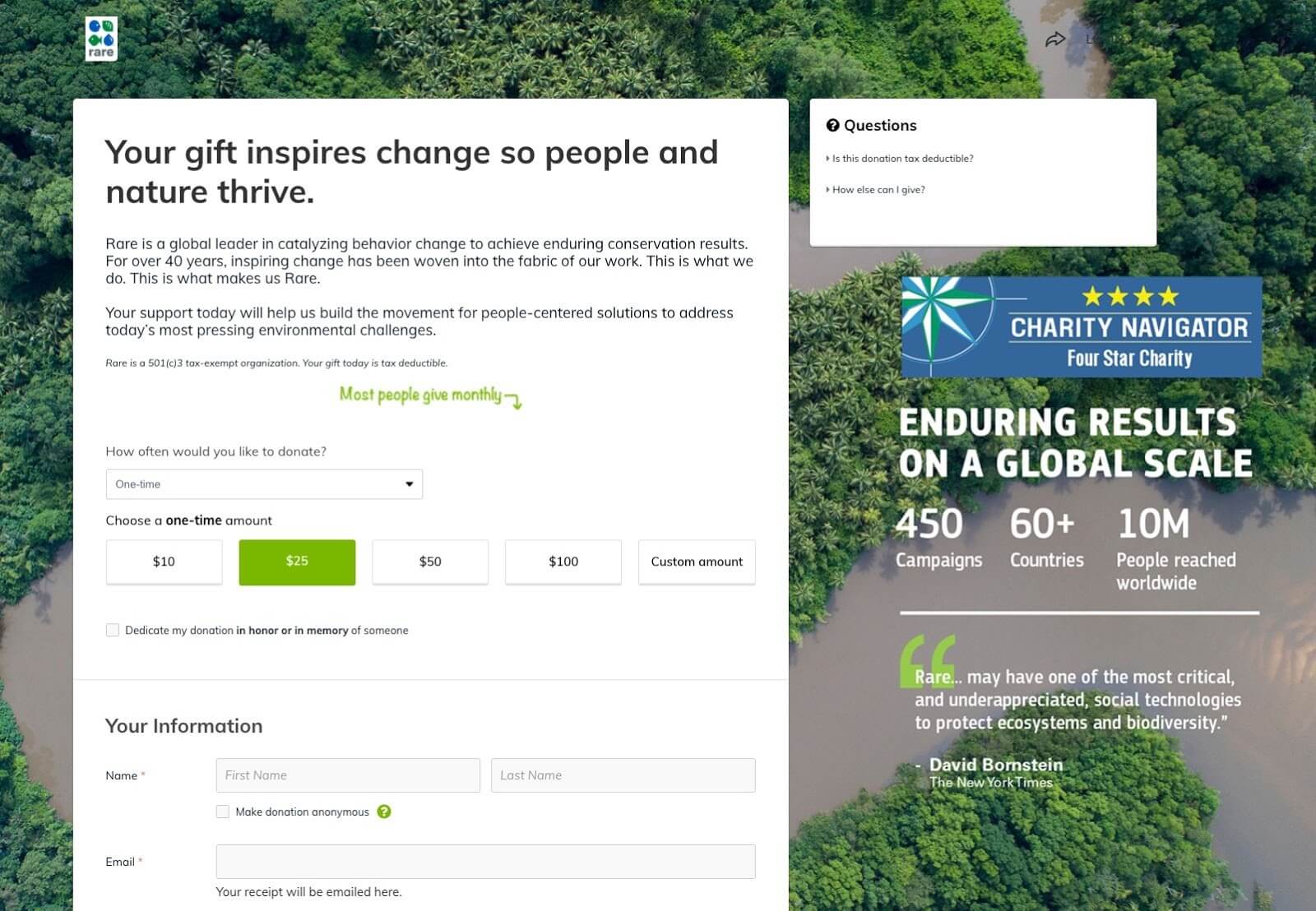
Rare does all of the above!
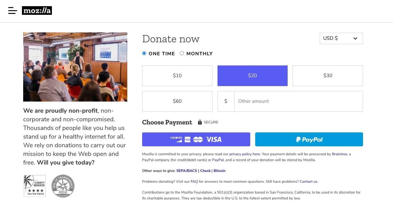
Mozilla also does an amazing job of including these key elements, even in a small space.

3. Where is the website visitor coming from?
Many nonprofits have a single online donation page linked from dozens of buttons, blog post links, social media posts, and even paid ad campaigns. And while this set-up might seem like an efficient use of limited resources, it can actually pose a big problem. Why? Because the exact same donation page won’t make sense for every scenario and every website visitor.
For instance, consider the very distinct paths that could all lead to a donation page:
- One visitor may come from an email newsletter where you request donations for an especially high-need or topical program. This visitor needs to see this program on the donation page.
- A visitor may come from your website’s home page and is simply exploring. This visitor needs to see more information about you.
- Some visitors may come from a paid ad on Google about in-kind donations. These visitors need to see information relevant to corporate donors.
The key takeaway is that each person is coming to the donation page with very different expectations, needs, and questions. If those expectations are not met as clearly as possible, the visitor is more likely to leave than to donate. So while creating different versions of your donation page can feel like a lot of work, it’s one of the best ways to convert donation page visitors into actual donors.
Action Item #3
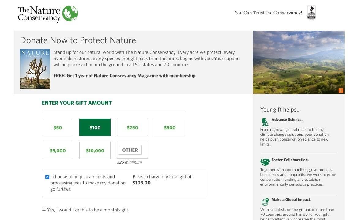
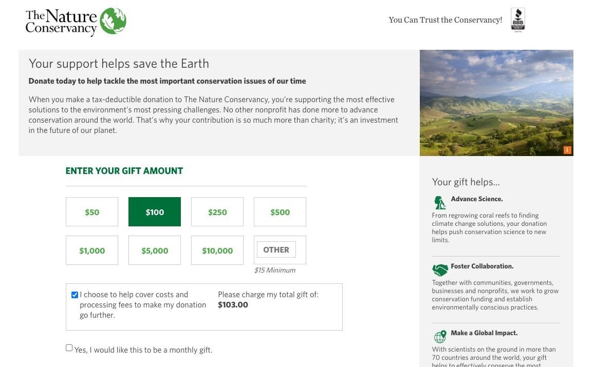
Resist the easy path of having a one-and-only donation page. Instead, create different versions for different user journeys, like The Nature Conservancy has done. Seen below is their regular donation page, which comes with an offer of a free magazine subscription that might appeal to a casual website visitor.
The next example is a landing page linked from a Google search of “donate to save wildlife.” Notice how they’ve replaced the magazine offer with a statement about what they do and why they do it better—aimed at convincing me, an active Google searcher, that I’m in the right place. By creating a slightly different donation page for this paid ad, they can better target their messaging (and test out different versions) without impacting their website’s general donation page and magazine subscription offer.
4. Is the donation page copy clear and captivating?
People don’t read online, right? Not necessarily. People read what they care about—and if website visitors care enough to consider giving their money to you, then they probably care enough to read a few words before pulling out their credit card. Your donation page should contain thoughtful, well-written copy that encourages the website visitor to follow through and finish the race.
Highly effective copy for a nonprofit donation page will be succinct and snappy while also:
- Explaining what you do and why this donation matters
- Reflecting your ideal donor’s deeply held values and beliefs
- Speaking directly to the donor, using words like “you” and “we”
- Making the visitor feel included in—and essential to—your vision of the future
- Matching your nonprofit’s brand voice (and visual design)
- Creating a (gentle!) sense of urgency
- Matching the user’s expectations based on how they came to this page (see question #3 above)
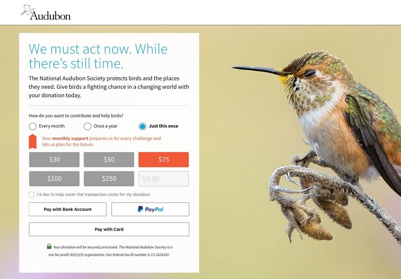
National Audubon Society instills urgency and uses that inspiring “we” on their donation page.
NAACP also does a great job. Their donation page uses powerful language that matches their brand, includes both the “we” and the “you,” and explains what your gift will accomplish.

Action Item #4
Refer back to the bulleted list above and compare it to your nonprofit’s donation page. Within the headlines, paragraph text, labels, and buttons on your donation page, are you:
- Explaining what you do and why this donation matters?
- Reflecting your donors’ values and beliefs?
- Speaking directly to the donor?
- Making the visitor feel included and essential?
- Mirroring your nonprofit’s brand voice?
- Instilling a sense of gentle urgency?
It can take time to find the right messaging on your donation page, but it’s worth the effort. If you can get alignment from your team, I’d also recommend A/B testing different versions of donation page copy. Testing is the best way to discover which messages resonate.
5. Could the donation form be simpler?
A great donation page is a balancing act. It has to have enough information to inspire the gift and enough fields to collect the required data—but never so much that the user feels overwhelmed or demotivated. And the most common culprit for overwhelm by far is the donation form itself. For example, check out at the anonymized donation form below. The screenshot is only one-third of the entire form, and it’s safe to say that “overwhelm” is the first word that comes to mind!

Action Item #5
Look at your donation form. How many rows, columns, and fields does it contain? Do the form fields give a visual appearance (or even a mental perception) of a lengthy, painful to-do list? Does the entire form take more than about a minute to get through? Are you asking for information that could be gathered later?
To keep your donation form as simple as possible, go through it with a fine-toothed comb and ask for only the essentials. You can always request more information on the thank you page or by email. The shorter, simpler, and cleaner your donation form, the less mental burden the donor will feel. Other recommended ways to simplify your donation form include:
- Removing all unnecessary form fields
- Having the donation page on your own domain, not a third-party URL
- Improving alignment and sizing of elements so that it looks cleaner and shorter
- Using a more legible font
- Creating a divided or “stepped” form
See how Mozilla achieves simplicity without sacrificing any of the key trust-building elements?
Wrapping It Up: Where Will You Start?
Wherever you begin to tackle your donation page optimizations, even small changes can and do make a difference! I hope you now feel empowered to look at your donation page in a new light. By using the five questions above, a little elbow grease, and some A/B testing, you’ll be on track to improving the donor experience and getting more donations online.
About the Author
Andrea Schlottman is a graphic designer, copywriter, and content strategist. She’s half of Pixel Lighthouse, a digital agency that helps nonprofits make a bigger impact online. When she’s not working with impact organizations, you’ll find her practicing on the yoga mat or making a mess in the kitchen.