As part of a team that runs a nonprofit, you are probably well acquainted with the difference your organization is making. You may even expend a lot of time, effort, and / or funds spreading awareness and trying to show the impact your nonprofit has. Polls and surveys indicate that people are more likely to donate to a cause that they know is making a difference, but the question is: How do you let people know, without a doubt, that your nonprofit is succeeding in its mission?
As you’ve probably guessed, infographics can be a huge asset in your cause marketing campaign. You want to engage your current audience and give them an easy way to share your services, program, or message with others – whether they are sharing via promotional materials, social media, or even email. Without creating a massive PDF discussing the allocation of funds, writing blogs discussing the progress of new program creation, or even publishing a lengthy journal article on how your volunteers are working, you can show people that your nonprofit is undoubtedly effective.
How to Structure an Infographic for Your Nonprofit
Just like any other infographic you create, the idea is to be clear, concise, and to the point. You also want to make maximum impact with minimal text; the more your audience has to read, the less likely they’re going to be drawn in by your infographic, plain and simple. Take this infographic from Compassion International:
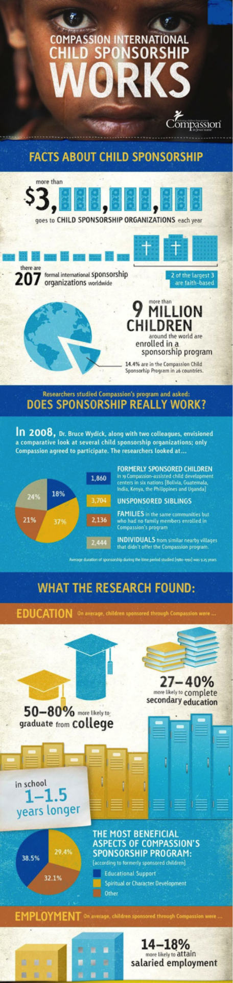
This infographic tells you everything you need to know about the differences sponsorship makes in a child’s life, and shows the research in interactive and creative ways. There is no excessive text, and the text that is present is short, concise, and well-written. Another thing this infographic does well is it immediately draws the audience in; infographics appeal to the emotional brain, so make sure you use images that show the people, animals, or places that your nonprofit is benefiting.
Ask for help
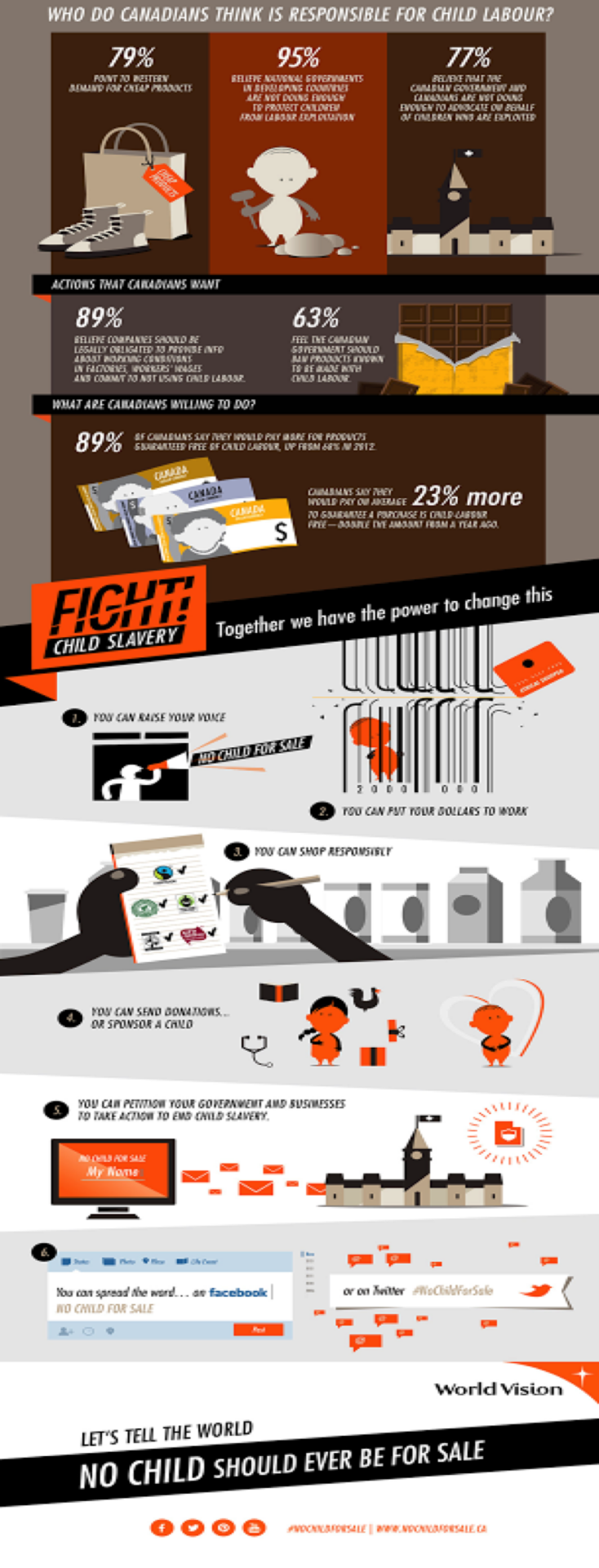
Another option for your nonprofit’s infographics is to focus on the difference people can make by engaging with your nonprofit or supporting your cause. This can come in the form of A) giving options, and B) showing the difference those options make in numbers. Take this next image below. It highlights the concerns and shows No Child For Sale’s mission, and then gives the audience a range of options that let them help. This triggers that emotional response once again, and the visual statistics stick in their minds much better than a written article alone.
Show your purpose
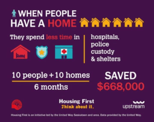
And then there is another option, the shortest and simplest of them all. The infographic below illustrates the main intent behind the nonprofit and illustrates exactly what sort of difference their efforts make in blunt, bright statistics. Housing First essentially lays out their mission in 30 words or less, and they have designed a simple infographic that is easy to consume and harder to forget.
Show your impact
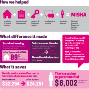
And then there is the “Difference Made” infographic, which essentially shows your audience and potential donors exactly how you’re using your funds, what the greater impact of your programs are, and why more people should donate. This is usually relegated to the extensive white paper PDF packet that many nonprofits create to explain their expenditures and overhead, which tends to be incredibly dry and hard for the average audience to consume. Not only can you insert great infographics like the one below into your dryer—yet necessary—information packets, but you can also use it to generate social media buzz. This highly visual, bright infographic explains what MISHA does, why they do it, and who they have helped in the process without being overwhelming.
It is projected that people who use infographics and other visuals in their cause marketing campaigns, social media, and email experience at least a 35% increase in engagement. For your nonprofit, that could mean 35%+ increase in donations, media awareness, volunteers, and / or connections. It is also believed that visuals help sway your audience to make an emotional decision, which can help increase your visibility as well as your bottom line. If an infographic can be so powerful in generating buzz for your nonprofit, why not start creating and using them today?
Do you know of other options to help nonprofits create infographics or is there something you’d like to add? Join the conversation below!
Originally published 11.21.16—Updated 12.19.17