Imagine donating money to a cause you believed in and never hearing back from the nonprofit organization. It leaves a bitter feeling, doesn’t it?
This is why nonprofit impact reporting is so important. In fact, 18% of donors leave or stop donating due to poor communication.
Whether you’re keeping donors updated, presenting a case to internal stakeholders or creating an annual report design that speaks to stakeholders, demonstrating impact plays a key role in nonprofit communications.
The idea is to inform and reassure external and internal stakeholders about the impact your nonprofit is having. But, it isn’t enough to create a wordy report or bombard your audience with numbers. You need to measure nonprofit impact, according to McKinsey and communicate value in a visually-appealing manner so that it draws readers in and keeps them engaged.
Here’s how you can use visuals to effectively communicate impact and make it count.
Highlight milestones using timeline infographics
Consider these statements: “Hosted a charity run. ” “Hosted a charity run and raised over $1 million toward cancer research. ” Which statement is more impactful? Clearly, the latter.
That’s because people want to know what your nonprofit has achieved–which is reflected in the second statement, as opposed to the first which merely states an activity. After all, nothing says ‘impact’ like accomplishments.
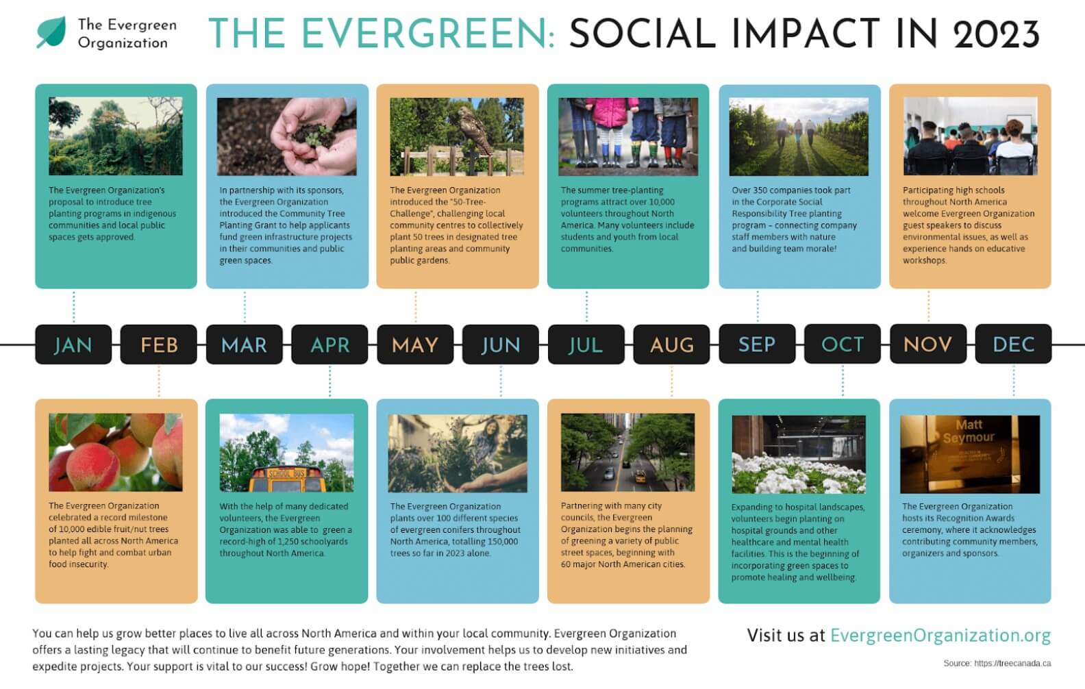
An effective way to present your nonprofit’s achievements is by using a timeline infographic. It helps readers visualize the various milestones you’ve achieved along the way without getting overwhelmed.
Here’s a good example of a nonprofit timeline infographic that highlights milestones achieved for each month of the year. One look at it is enough to reassure donors that their money is being well-utilized, which helps increase donor retention.
Source: Venngage
Use illustrations to emphasize the problem
Let’s say, you funded 50,000 water projects and reached 10,000,000 people.
 The numbers sound great but what does this mean to the average donor?
Communicating impact is not just about jumping straight into the numbers. You have to provide context and address the burning problem your nonprofit is trying to solve and make people believe in your cause.
A better way to present this information would be to start by telling the audience how many people lack access to clean
and safe drinking water. Once everyone understands the problem, your fundraising impact numbers are sure to leave a more lasting impression.
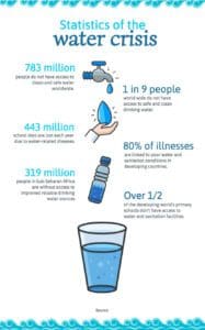
You can educate your audience about the cause by using illustrations. Not only do they inject personality into the communication but they also make it easier for people to scan and digest information.
Take a look at this infographic that uses illustrations to throw light on the global water crisis. It complements startling statistics with bold fonts and illustrations that capture attention and make people want to read it.
Source: Venngage
Use charts to present statistics and financial figures
Your nonprofit impact communication is bound to be filled with statistical data and financial figures.
You can either present it in words or use data visualization to communicate the same information more clearly and effectively. The idea is to present data so that it’s pleasing to look at while being functional in its communication.
Here’s how you can use different types of charts to communicate impact:
- Highlight a single data point (use donut charts)

Source: Venngage
- Make comparisons (use bar charts, pie charts, stacked bar charts)
Source: Venngage
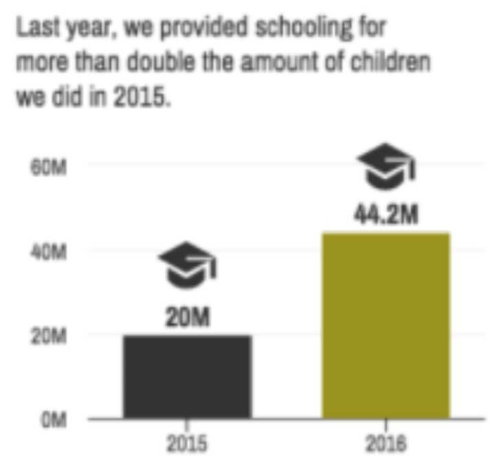
- Demonstrate change over time (use line chart, area chart)
Source: Venngage
- Present groupings or rankings (use tables, flow chart)
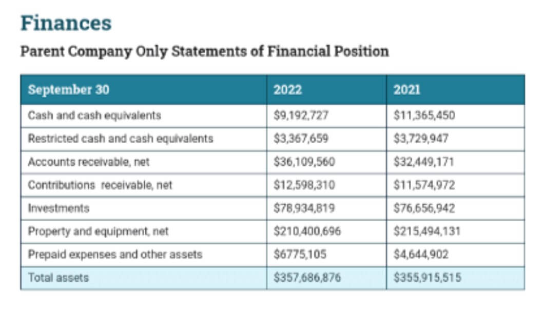
Source: Venngage
Here’s an example of a nonprofit using donut charts and tables to highlight important statistics and figures, making it easier for the reader to interpret the data. Notice how it uses a contrasting color (orange) to highlight key categories and statistics.
It’s also important to pick a consistent color scheme in line with your brand colors while using charts and other visual elements.
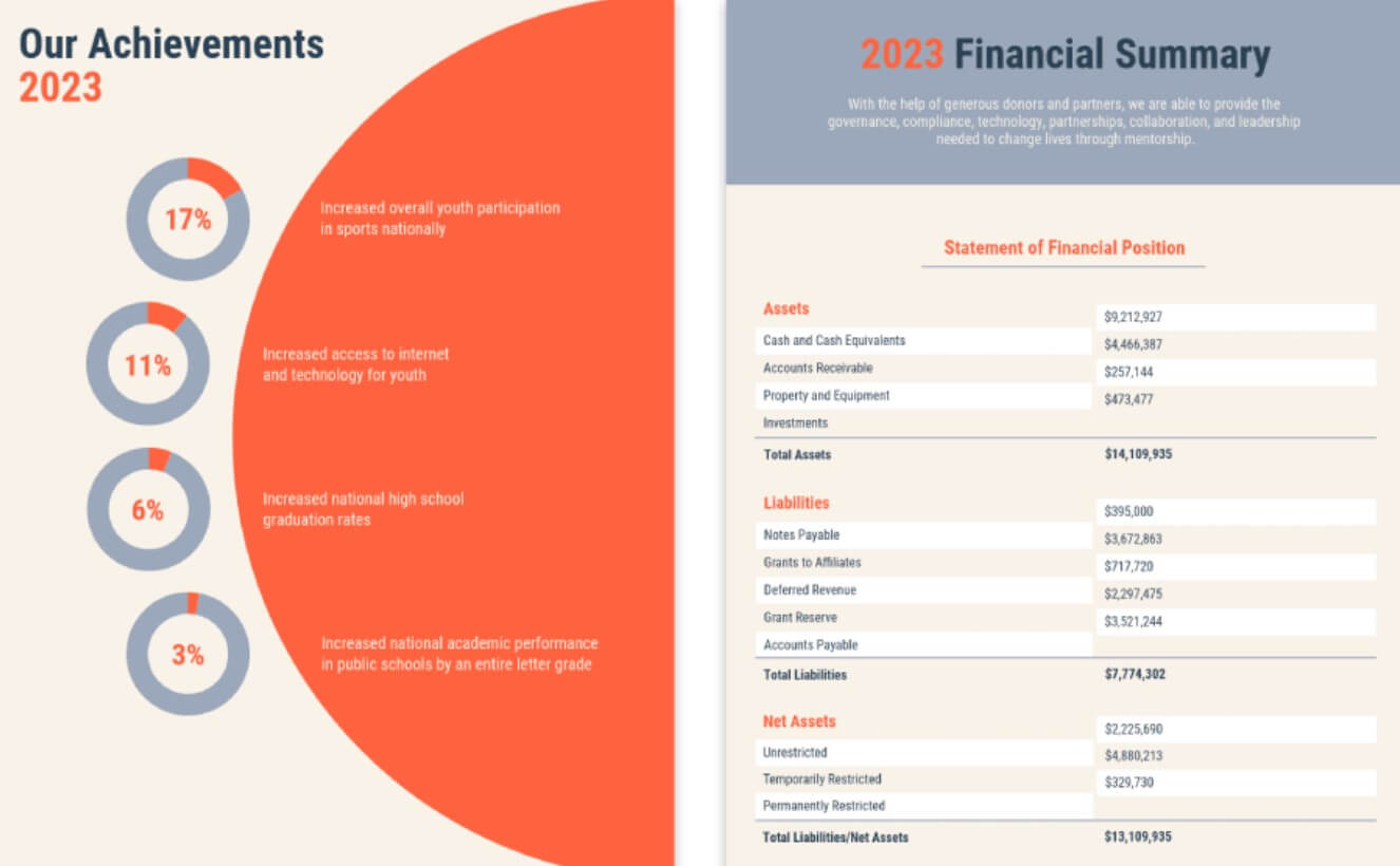
Source: Venngage
Add real photos and video testimonials to strike a chord
While original graphics such as infographics, charts and illustrations are necessary for nonprofit communication, photos of people your nonprofit is impacting are powerful in their own way.
They successfully capture attention and evoke emotional responses thereby inspiring action. Using real photos puts a face to the cause, making it easier for your potential and current donors to trust your nonprofit organization. 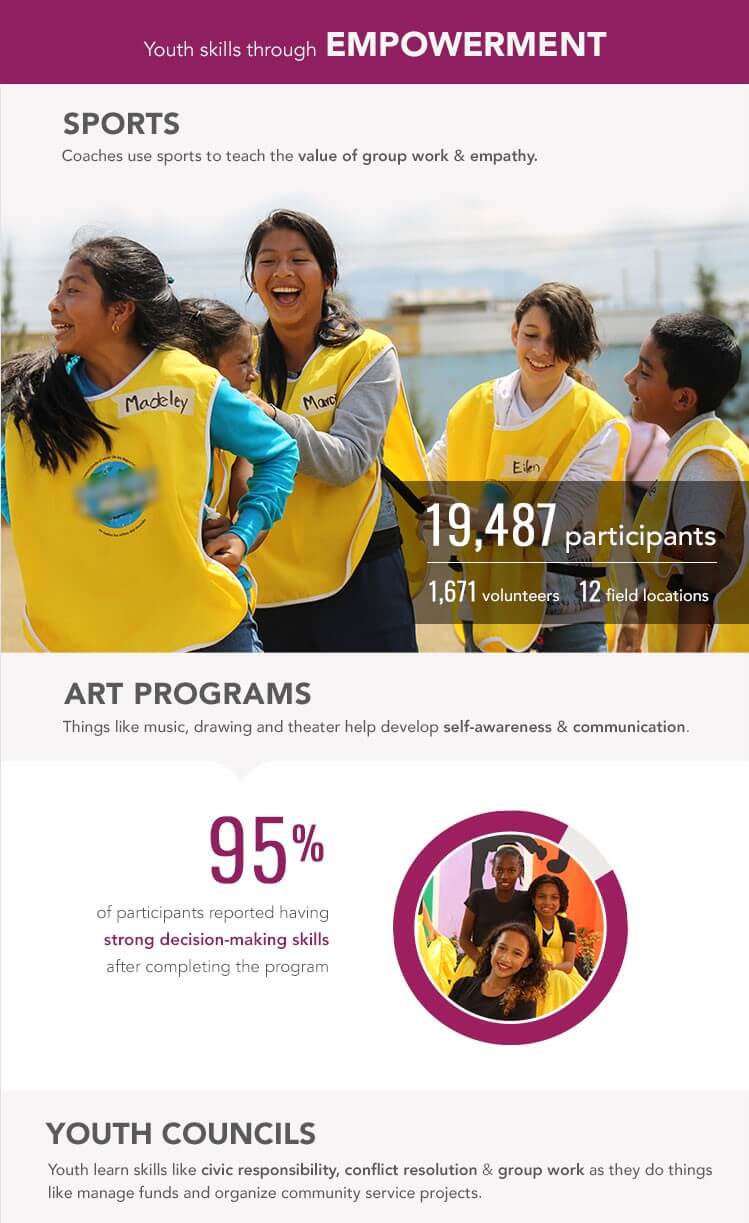
Here’s an example of a nonprofit organization, Children International, that uses authentic imagery to strike a chord with their audience, giving a glimpse into how they are transforming lives.
While using real-life photos, it’s common to wonder whether you should opt for photos with happy faces or sad ones. An online experiment was conducted to test both approaches.
It’s interesting to note that sad pictures worked better for people who didn’t feel personally connected to charities. On the other hand, those with high levels of charitable involvement showed more intentions to donate after looking at happy-faced pictures.
Another type of social proof you can use to demonstrate impact is video testimonials from those who have benefited from your nonprofit organization. Make sure you ask the right questions to get the most out of these testimonials.
The takeaway: use visuals to strengthen your nonprofit impact report
As a nonprofit organization, your ultimate goal is to enrich the lives of people. Hence, stakeholders involved will want to know how impactful your work has been and the difference you’re making in the world.
Make your nonprofit impact report count by moving away from boring communication and implementing these visual strategies. They will help you communicate impact more effectively while sparking emotional reactions and building trust.
Author Bio
Simki Dutta is a content marketer at Venngage, a free infographic maker and design platform. When she’s not working, she can be found refreshing her Twitter feed and binge-watching Netflix shows. Find her on Twitter and LinkedIn.