Let’s face it—when it comes to your website, looks do matter. It only takes a split second for a viewer to decide whether or not they’ll spend time on your site, and website design is often the deciding factor.
Don’t just take our word for it—we’ll use our own website design as an example.
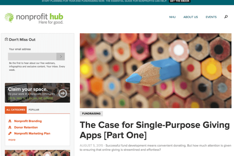
Check out this screenshot of nonprofithub.org from 2015. Can you believe this was just four years ago?
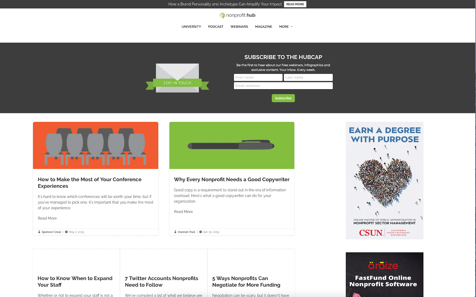
It’s not awful, necessarily, but if it still looked like this today, people—especially younger viewers—would spend a lot less time on our site. So, we gave it a makeover last year.
This website design is much more organized and eye-catching than the last. We modernized our display, replaced stock photos with simple, colorful graphics, imported external ads and made our internal ones look, well, better. It’s allowed us to draw new readers and followers to our site every day.
If you’re still not convinced, here are some reasons why it’s so important to have a well-designed website that’s modern and accessible.
First impressions matter
People will likely hear about your organization from the internet, which means the first thing they’ll see from you is your website—and they’ll judge it right away.
A bad first impression can mean they’ll close out the tab, and you’ll never receive another page view from that person again. A good first impression can lure them further into your site and open the door to potentially life-changing donations, volunteers and relationships. Yes, websites really do have this power, and design can be the difference between a bounced user and a donation.
Each time you open your site, view it in the eyes of someone who’s never seen it before. If you were an outsider visiting the page for the first time, what vibes would you get? Would you feel compelled to stay on the page?
Professionalism
Even if your organization has a sleek office and a formal dress code, most of your viewers won’t see it—they’ll see your website. Think of your site as a direct reflection of your nonprofit’s reputation and character. Take a good look at it and ask yourself, “Does this make our organization look trustworthy? Is this how we want to present ourselves to the world?” If you answer no to either question, consider making some changes.
Accessibility
Yes, good design makes your website look pretty, but equally important is its functionality. Your site is a tool that allows supporters to get involved with your organization, so set it up in a way that’s simple, direct and easy to maneuver.
When your call to action buttons (which urge people to donate, subscribe to your newsletter, volunteer, etc.) are clear and visually attractive, you’ll get more engagement than if they were hidden at the bottom of the page. Strive to make your website as user-friendly as possible so adolescents and grandparents alike can figure it out.
Of course, not everyone is a graphic designer or computer programmer. It can be a challenge to create a cohesive, accessible design for your site that’s also aesthetically pleasing, but all these things are becoming increasingly important. Whether you hire someone, use a simple web-building service like Wix or WordPress or simply try your best to make small improvements, creating a website that’s both pretty and practical should be one of your top priorities.


