Millennials are set on making a difference.
In fact, only 15 percent of millennials didn’t give to an NPO in 2013. So how do you get even part of that 85 percent to donate to your organization? The answer for your nonprofit is through branding.
Yep. I said the words “brand” and “nonprofit” in the same sentence. Millennials have huge potential in the nonprofit sector, and ultimately the way to tap into it and win the hearts of millennials is branding.
There’s enough on creating a stellar brand to fill a college course, so we’ll focus on the visual brand—specifically your web design.
I know, I know… buzzwords like branding and brand loyalty in the nonprofit sector tend to make people cringe because they think of the “stuffy corporate world,” but in this case a nonprofit having good branding leads to brand loyalty which means donor loyalty. If 85 percent of millennials are giving to NPOs, where are they giving? Make your NPO their first choice. Creating an immaculate visual brand—specifically within your website—for people to connect with is the way to stay top-of-mind when faced with the question, “Where should I donate?”
Start with the Basics
So what exactly goes into an immaculate website? Contrary to popular belief, a great nonprofit site doesn’t start with a “sexy” cause. A lot of nonprofits don’t think that their cause can be translated to the general public as well as it can be to their current base, or people who are innately fired up by their cause, because of past experiences.
The recipe for a great visual brand at its core is a memorable logo and a simple and intuitive website. Do you have the type of nonprofit brand that a college student wants to support by slapping a sticker on their computer? Do you have enough buzzability that they would want to wear a shirt with your organization’s logo on it? If the answer is no to either of those questions, your organization could benefit from not only a site revamp, but an entire revamp of your NPO’s brand kit in general.
Think about your website as the digital version of your physical location that has (arguably) more ability to engage supporters. When a new constituent visits your website, two things should happen almost immediately. First, your site should have a visual hook to keep users around, minimizing the bounce rate. These visual hooks include a lot of compelling and high resolution pictures, embedded video content, videos in the background, interactive scrolling and clear calls-to-action.
Make Your Messaging Consistent
Second, your site should send the same message as your mission and vision without explicitly stating it in the copy. Keep in mind that these two things aren’t exactly mutually exclusive. If you have awesome visuals such as pictures, videos and clear calls-to-action that all relate back to your NPO’s purpose, you’re more than likely killing both birds with the same stone.
Keep an Eye on Aesthetics
Finally, be sure to optimize the functionality and aesthetics of your site. Your navigation should only takes up one line in the header bar. In each drop-down menu, keep the options to under eight items. If your goal is to gain donations, keep a call-to-action for donations either as a static button in the header, or something that occurs on every page in some form. Another aspect to consider would be converting to a responsive website. They’re extremely user-friendly and have actually been linked to raising conversion rates if your organization has the means.
Need inspiration or examples of these tips? Here are three sites that I like:
St. Baldrick’s
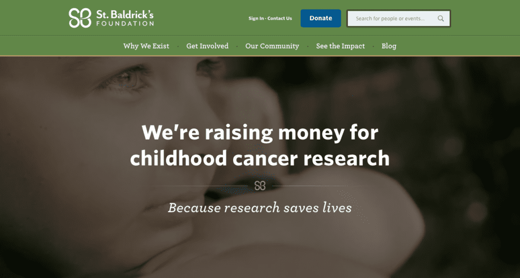
The St Baldrick’s Foundation is a great example of a site that portrays the mission and vision with minimal copy. Plain and simple—they’re a foundation that raises money for childhood cancer research, “because research saves lives.” Without reading more than 10 words and a conjunction you see that they bring people together in the name of defeating cancer.

charity: water
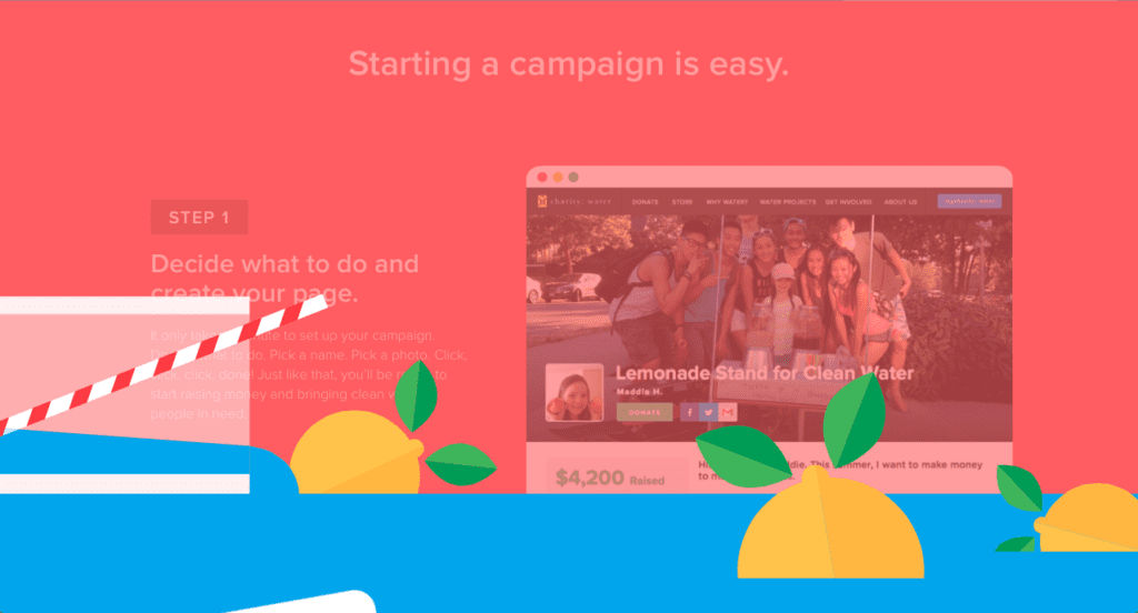
charity: water is unique because rather than asking for a donation straight up, they spark movement in people, which is conveyed in their site by the use of movement in interactive scrolling. You read the information on the page naturally because the copy isn’t just words on the page, but plays into the overall design of the site.

Skate for Change
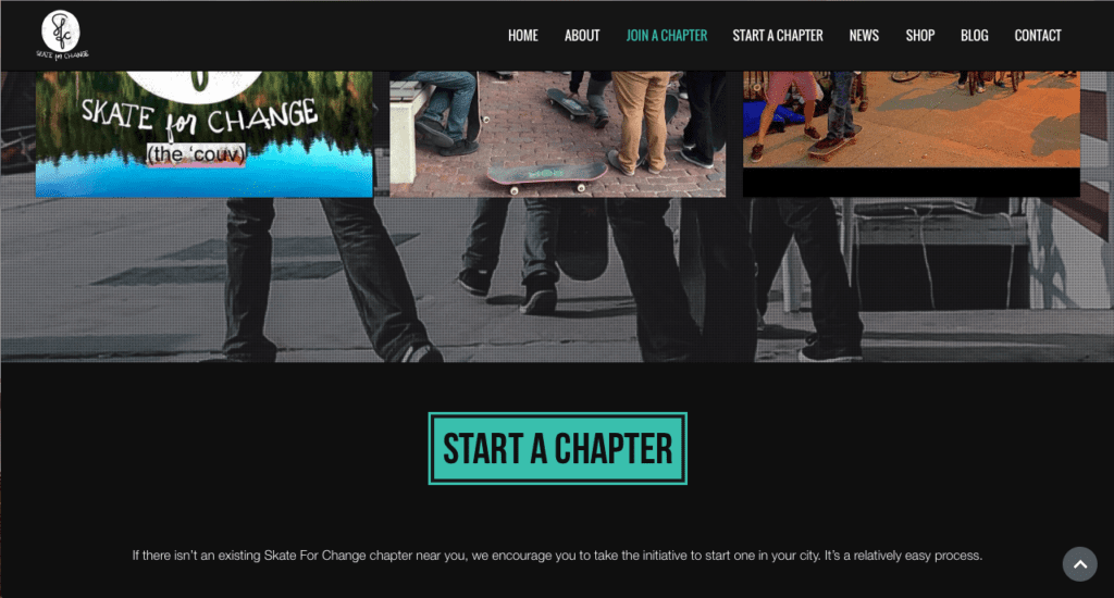
There are many things I can commend Skate for Change on doing within their site—maybe I’m just biased because they’re homegrown from my hometown—but my favorite thing about their site is the framework around their call-to-action. It’s surrounded by pictures and an embedded video that shows the impact they make as opposed to telling about it. They inspire you to join their movement and either start or join a chapter. The actual call-to-action buttons are brightly colored on a dark background and are simple enough to understand while still sparking more interest.
Tl;dr (Too Long; Didn’t Read)
Millennials are dedicated to making a difference, so we find the insight is not that we need to try to get them to donate or volunteer in the first place, but to choose your organization as their go-to when they decide to do so. This generation is vastly visual, so the importance of creating an extremely appealing, interactive, and user-friendly website can not be overstated. Nonprofit branding is far deeper the logo and website, but that doesn’t change the importance of making sure they still represent your NPO and spark interest in young minds.


